reading-notes
CSS Flexbox
Readings
Notes
What is Flexbox?
- A one-dimensional layout method for arranging items in row or columns
- Items flex (expand) to fill additional space or shrink to fit into smaller spaces
- Set using
display: flex;in CSS
Why Flexbox?
- Simplifies vertical and horizontal alignment of a block of content inside its parent
- Makes all children of a container take up an equal amount of the available width/height
- I.E. Auto-sizes the children and evenly distributes them within the space available inside the parent
- Makes all columns in a multi-column layout adopt the same height, even if they have a different amount of content
Simple Example
-
Assume you have an HTML file that has the following structure:
<header>Sample flexbox example</header>
<section>
  <article>First article</article>
  <article>Second article</article>
  <article>Third article</article>
</section>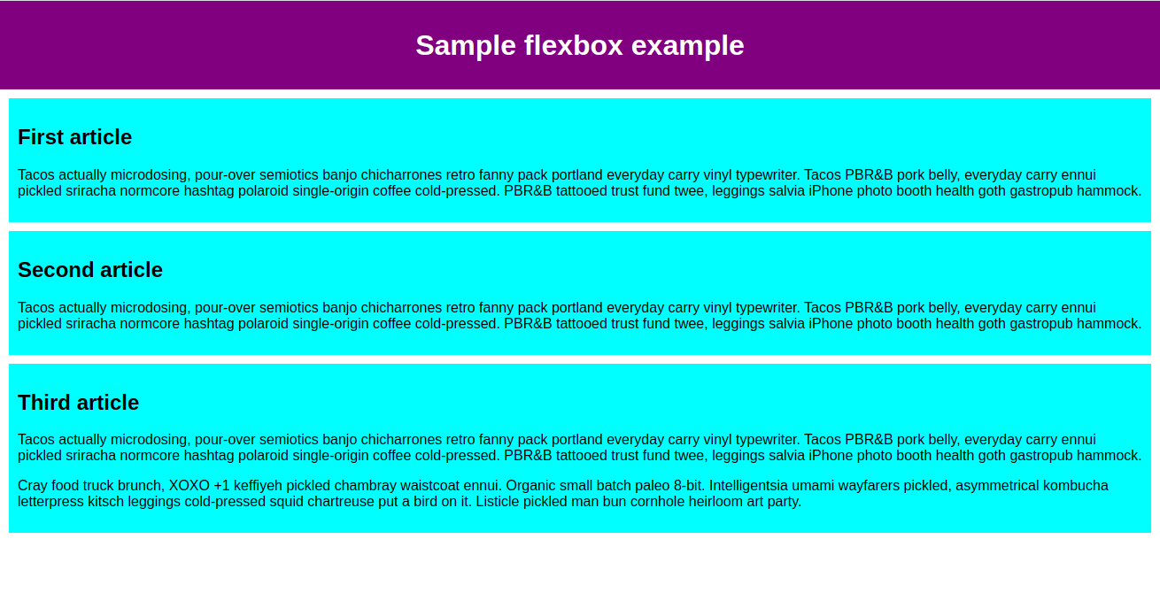
-
We now select the elements that we want displayed as flexible boxes
- In this case, we want the
<artilce>elements to display as flexboxes, creating 3x equal sized boxes evenly distributed within the parent element<section>
section {
  display: flex;
}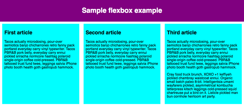
- In this case, we want the
The Flex Model
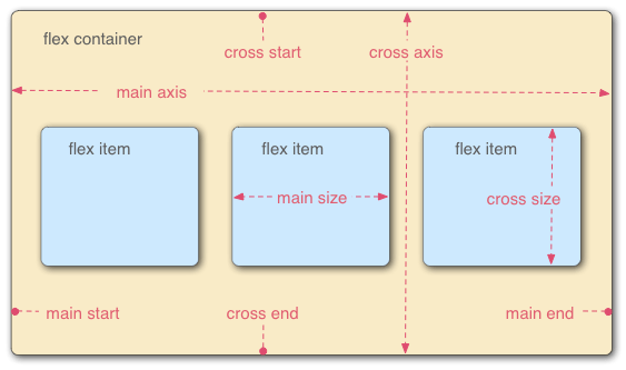
- Flex elements are laid out on two axes:
- Main axis
- Runs the direction of distribution
-
This property can be changed with
flex-directionflex-direction: column;
-
- Runs the direction of distribution
- Cross axis
- Runs perpendicular to the main axis
- Main axis
Wrapping
- You can allow text to wrap inside your flex items using
flex-wap: wrap; - You can set the width of your boxes flexibility with
flex: unitOfMeasure;
Flex-Flow Shorthand
flex-direction: row;
flex-wrap: warp;

/*becomes*/
flex-flow: row warp;
Flex Sizing
- Can create dynamic sizing using the
flexproperty flexis a unitless value that dictates how much space an element will take up along the main axis relative to other elements in the space- For example:
- 3x elements with
flex: 1will each take 1/3rd of space available - But, if 1x element was set to
flex: 2, that element would appear twice as large as the other elements (see below: Third article)
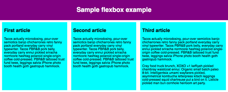
- 3x elements with
- NOTE: Use flex shorthand to prevent extra long code
flexcan specifyflex-grow,flex-shrink, andflex-basis
Suggestion for Navigation Buttons in Header Menu
div {
  display: flex;
  align-items: center;
  justify-content: space-around;
}